

3-Week Client Brief
@ General Assembly SG
22nd April - 13 May
Role
UX Designer.
Research, branding, design, user interviews, workshopping, prototyping.
Research, branding, design, user interviews, workshopping, prototyping.
Understanding the challenge
Uncovering OUR Client'S Goals/EXPECTATIONS
With the knowledge that the Oclass client already has workflow's towards optimising their application, we had to come up with a plan on how we could value add to the client as were trying to work things out concurrently. The expectation was that our input should be targetted towards current users for specific up-and-coming studios and how we could improve or spot chinks towards their user journey's.
Knowing your competition
TAKING A DEEP-DIVE INTO OUR COMPETITORS


Our competitive analysis of ClassPass and Mindbody inspired the intuitive 'Search' function on our home screen, allowing users to easily find nearby affiliated studios. Additionally, OClass's 'Shop' section enables vendors to showcase and sell merchandise, fostering a sense of connection and ownership among users.
We also learnt through comparative analysis that applications that excel in retention and user experience adhere to a consistent design system, facilitating intuitive and efficient navigation throughout the app.
Identifying potential pain points within the app
FINDING OUT WHAT CURRENT USERS THINK
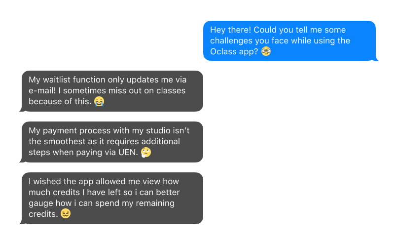
The team headed down to a few select studios to carry out interviews on how their current users felt and we uncovered a few insights based off their habits, motivations and challenges:
Finding out how new users perceive the app
FINDING OUT WHAT NEW USERS THINK
We then began to discover through open survey's and further app user interviews on the current app to find our more about what their first impressions and thoughts were from their app journey's:
USER PERSONAS
To visualise their needs better, we came up with 2 persona's so that we can relate and empathise better with their limitations, struggles, successes and goals.

Shiela, 27
How might we:
• Assist Shiela in accessing popular classes through regular updates or timely notifications?
• Enable Shiela to seamlessly join waitlists for fully-booked classes?
• Provide Shiela with the necessary information to remain on waitlists with confidence?
• Ensure Shiela to have clarity and confidence in her class schedules?

Howard, 53
How might we:
• Assist Howard in confidently locating and selecting a class of choice, completing the purchase transaction, and subsequently participating in the chosen class?
• Direct Howard towards the relevant information necessary for discovering classes of interest, facilitating a more efficient search process?
• Assist in streamlining Howard's payment process via the application for a seamless experience?
PROJECT GOALS:
• Have a class booking system waitlist that’s intuitive and seamless; even allowing for Shiela to easily join or hop out of for her class of choice.
• Have an intuitive payment system that’s seamless towards Howard’s needs so he can carry out purchases confidently.
Optimising the Waitlist functionality
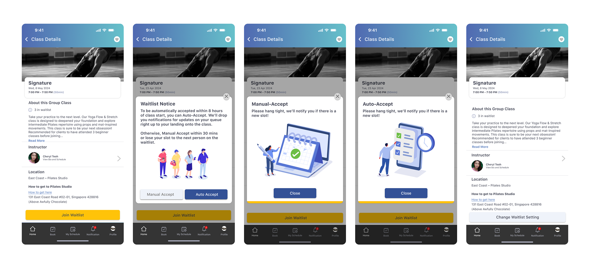
With how we've optimised this, users are now given the option of manually accepting a class or auto-accepting them. Manual accept gives them a 30-minute window to jump into the class, while auto accept bumps the user into the class automatically. The 2 options offer the flexibility of to pick one as according to their habits off booking classes.
After doing so, the following page then shows the button marked as “Change Waitlist Setting” to show they’re in the waitlist, while also giving them the option to change the settings. A notification will then be fired towards a successful slot allocation.
IMPROVING ON THE ALTERNATIVE UEN PAYMENT

Users for some studio's who only offer UEN as payment found it clunky to switch applications, document their studio's unique UEN somewhere, and have a screenshot of the payment be sent to their trainers via Whatsapp.
With that we helped with a functionality that copies their studio's UEN within Oclass, as by doing so this would help with the potential error's while keying that in. We also implemented a receipt submission feature so that it would omit the switching towards other app's to relay the payment.
With that we helped with a functionality that copies their studio's UEN within Oclass, as by doing so this would help with the potential error's while keying that in. We also implemented a receipt submission feature so that it would omit the switching towards other app's to relay the payment.
An approval process will then be set up within the app in which users can track them.
ADDITIONAL PROPOSAL TOWARDS NEW LAYOUTS
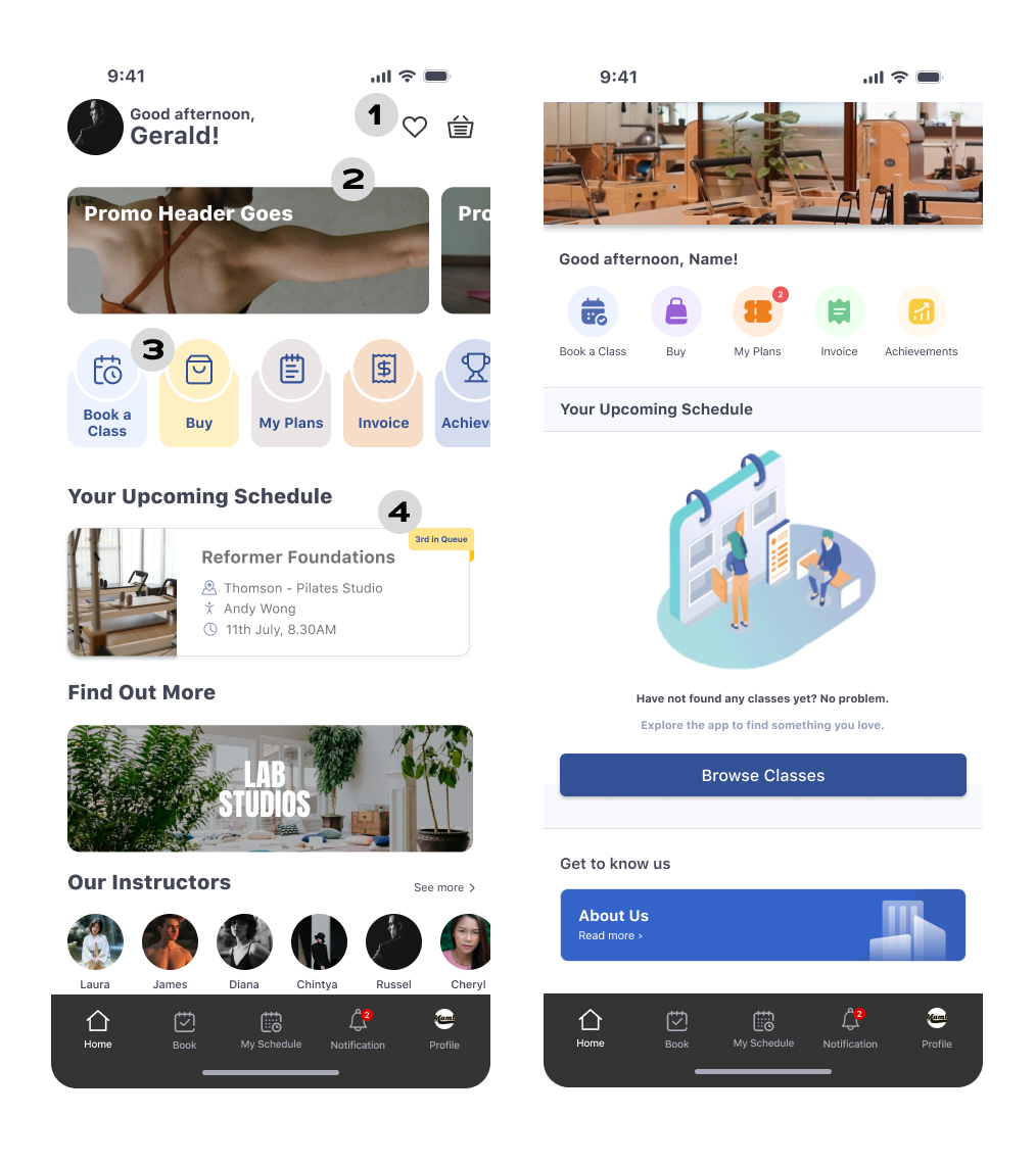
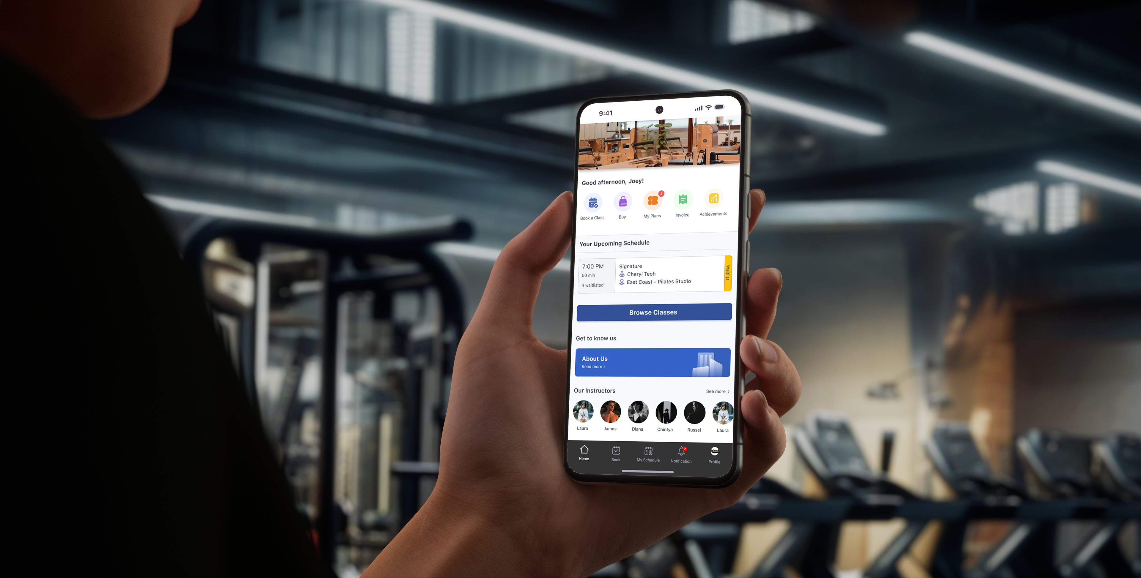
HOMEPAGE –
1. Added a heart icon next to the cart for easier access to potential favorite packages or classes, enhancing efficiency. Also added profile name on the left for clarity towards login details.
2. Prioritizing key promotions to appeal to bargain hunters.
3. Introduced a new set of icons with consistent colors and subtle background accents for a cleaner and more inviting look.
4. Enhanced upcoming scheduling information with icons aligned with quick navigation, and introduced a "Scheduling process" section featuring color-coded "Waitlist Information," "Booked," or "Cancelled" statuses.
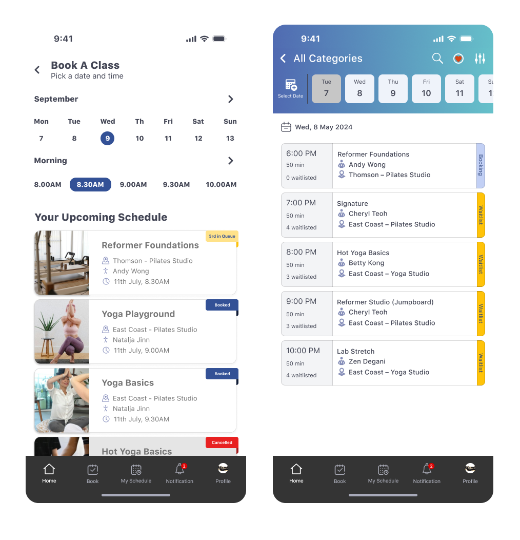
CLASS SELECTION PAGE –
We experimented with redesigning the time and date selection process by listing them separately, with a drop-down menu for selecting months and time of day. This approach aims to expedite the process, allowing users to specify their requirements more efficiently as the current version suffered from users scrolling too far ahead and losing track of their actual dates.
Classes that match the selected filters would be displayed below for easy access.

CLASS DETAILS PAGE –
For a sleeker look we increased the real estate of the class image for a card-like formatting. We also tried to improve on the hierarchy information with the buttons and credits so that it’s clearer for users at a glance.
USER TESTS AND REFINEMENT
With the optimisation's done, we tested the new journey flow's to see if these changes improved usability. The user test metrics used were based off efficiency of our new solution’s flow as well as the number of errors in the process. Here were our findings:

AUTO-ACCEPT PAGE
4/5 users shared that with their habits of joining waitlists, a timer of sorts would help so that a time-frame between the booking and their bedtime can be indicated so that they're notified before their sleep time. We added this feature so that users could fully utilise this functionality.
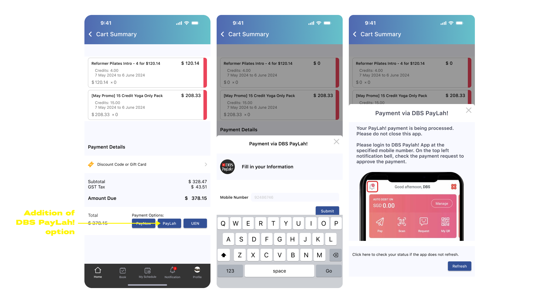
ADDITIONAL PAYMENT OPTION
4/5 users shared that while they found the UEN improvement helpful, having the option of PayLah! might also make things easier for them as an alternative.

BOOK A CLASS PAGE: NEW PROPOSED TEMPLATE
3/5 users shared that while this layout helped with things, the scrolling was still a tad confusing. With the subtle addition of an indicator beside the current date we're hoping it would improve the user experience of the functionality.
REFLECTION
There were a couple of learning points from this project; firstly having learnt the nature of user tests towards a controlled environment as compared to a guerrilla-styled approach in which it back-fired on us with less than expected feedback from users who were not obliged to offer us their time to feedback constructively.
We also learnt the complications and ceilings towards payment method's that are more so determined by the bank rather than client's themselves, as coming up with creative solution's might not necessarily work.
All in all it was a very fruitful proposal that peaked the client's interest in many ways as it helped them identify and pick up on areas of improvement towards what current users were faced with.